Client Overview
Our client is an innovative app development company that specializes in crafting user-centric mobile applications. They have a reputation for delivering high-quality iOS and Android apps across various industries, catering to the specific needs of their clients.
Project Scope
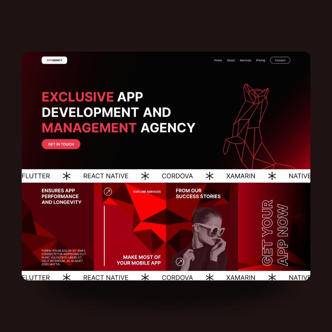
The client approached us to design a landing page for their website using Figma. The objective was to create a compelling, visually appealing, and conversion-focused landing page that effectively showcases their services, expertise, and client testimonials.
Objectives
- Visual Appeal: Design a modern and attractive landing page that aligns with the company’s brand identity.
- User Experience: Ensure an intuitive and seamless user experience, guiding visitors through key sections of the landing page.
- Conversion Optimization: Create elements that encourage visitor engagement and lead generation, such as clear calls-to-action and easy navigation.
Our Approach
1. Discovery and Research
We began with a thorough discovery process, understanding the client’s brand, target audience, and specific goals for the landing page. We analyzed competitor websites and industry trends to identify design elements and features that would resonate with the target audience.
2. Wireframing and Layout
Using Figma, we developed wireframes to outline the basic structure and layout of the landing page. We focused on creating a logical flow that would guide visitors through the page, highlighting the company’s strengths and offerings.
3. UI/UX Design
With the wireframes approved, we moved on to the visual design phase. Key aspects included:
- Brand Consistency: Using the client’s brand colors, typography, and logo to maintain a cohesive visual identity.
- Hero Section: Designing an impactful hero section with a compelling headline, subheadline, and a clear call-to-action button.
- Service Overview: Showcasing the company’s key services with icons and brief descriptions, making it easy for visitors to understand what they offer.
- Client Testimonials: Including a slider or section with client testimonials to build trust and credibility.
- Call-to-Action: Strategically placing CTA buttons throughout the page to encourage visitors to take the desired action, such as contacting the company or requesting a quote.
4. Prototyping and Feedback
We created an interactive prototype in Figma, allowing the client to experience the landing page’s flow and functionality. This step facilitated easy feedback and adjustments, ensuring the final design met the client’s expectations.
5. Design Handoff
Once the design was finalized, we provided the client with the Figma files and all necessary design assets. We also offered guidance to their development team to ensure a smooth implementation of the design.
Results
- Engaging Design: The final landing page design was visually appealing and aligned with the client’s brand identity, effectively capturing the attention of visitors.
- Improved User Experience: The intuitive layout and clear navigation made it easy for visitors to understand the company’s services and take action.
- Higher Conversion Potential: The well-placed calls-to-action and persuasive design elements were crafted to maximize visitor engagement and lead generation.
